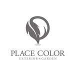
弊社のロゴは、「地図のピン」と「PLACECOLORの頭文字...
2025/12/10
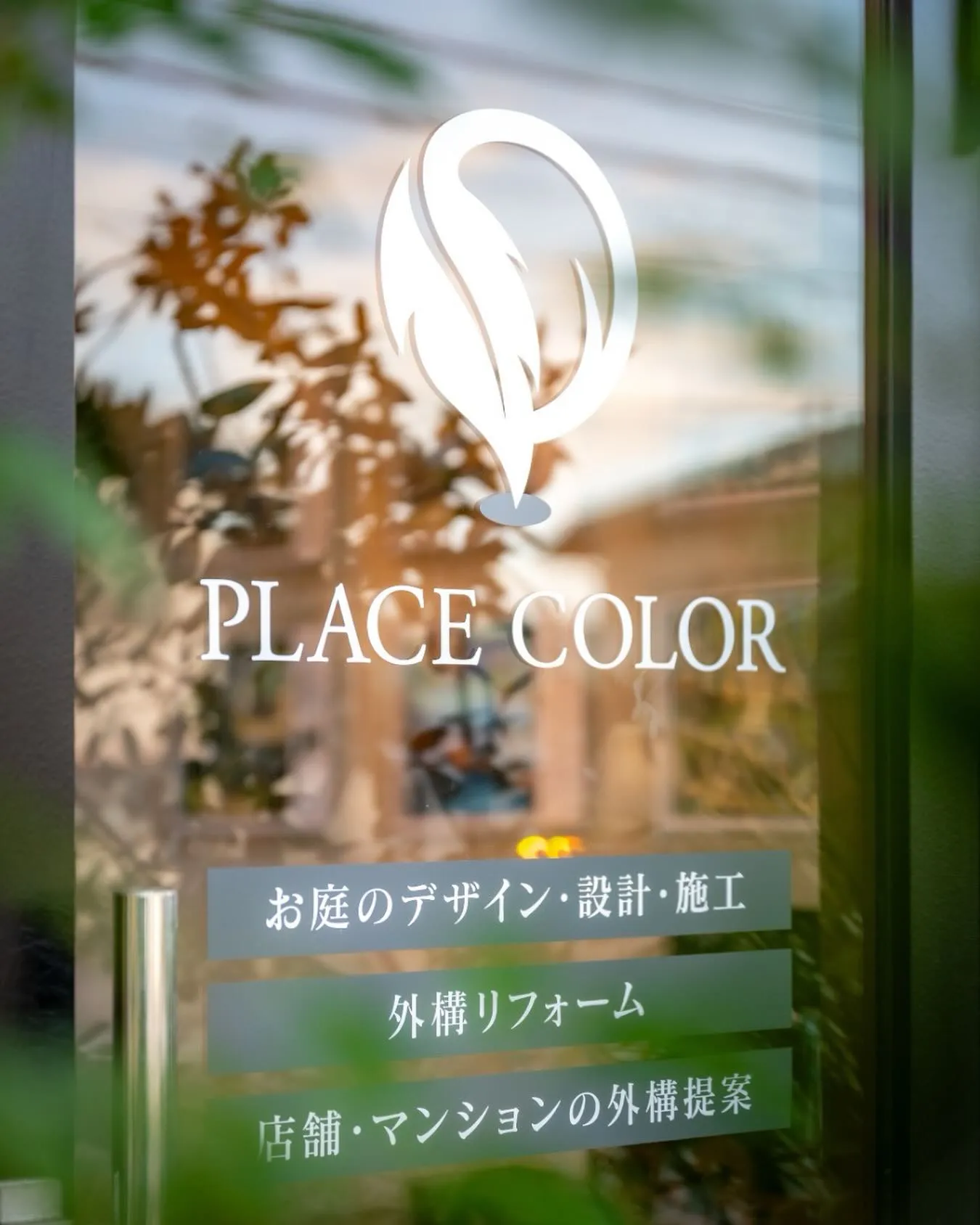
弊社のロゴは、「地図のピン」と「PLACECOLORの頭文字P」、そして「葉」を組み合わせてデザインしています🖌
その土地が持つ特性を読み取り、お客様のご要望と掛け合わせることで、他にはない“お客様だけの特別な空間”を演出したいと考えています。
また、「その場所をあなた色にしたい」「これから何色にでもなれる」という想いを込め、あえて無彩色で表現しました。
The Meaning Behind Our Logo 🖋️
Our logo blends a map pin, the letter “P” for PLACECOLOR, and a leaf—symbolizing our mission to create spaces that are deeply rooted in place, yet uniquely colored by you.
It reflects our belief in designing one-of-a-kind environments by harmonizing the natural character of each site with the vision of our clients. The choice of monochrome expresses the idea of limitless potential—an invitation to color the space in your own way.
@place_color
@place_color_shimizu_